
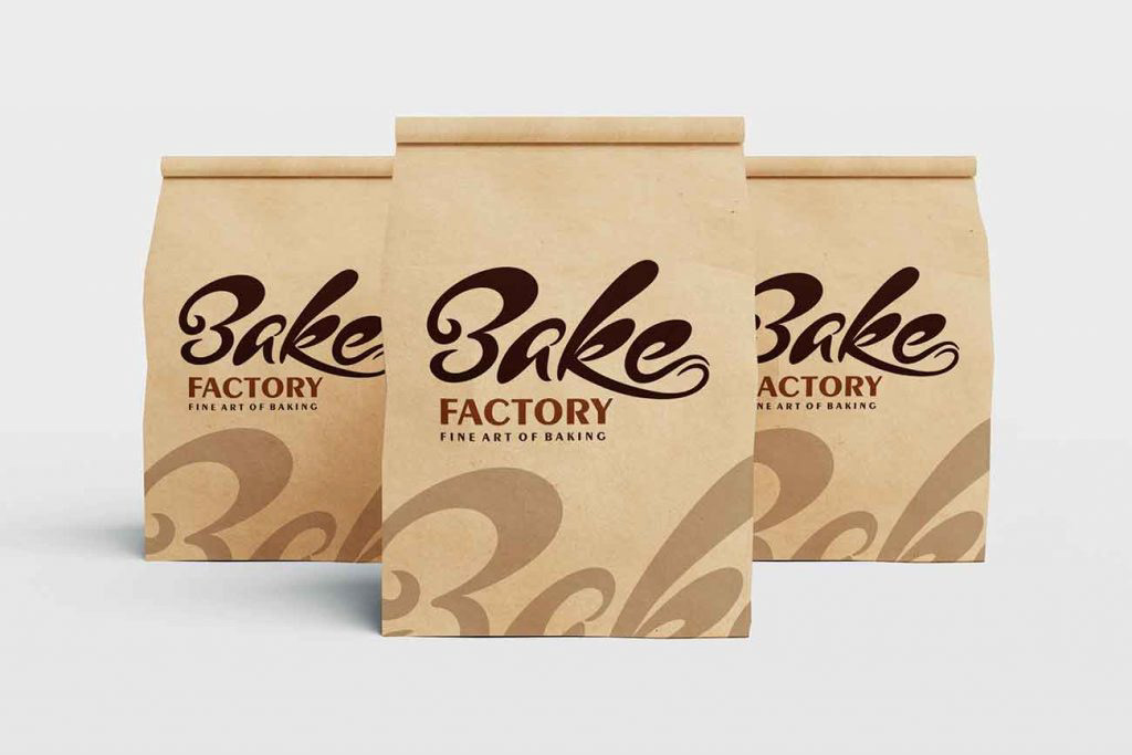
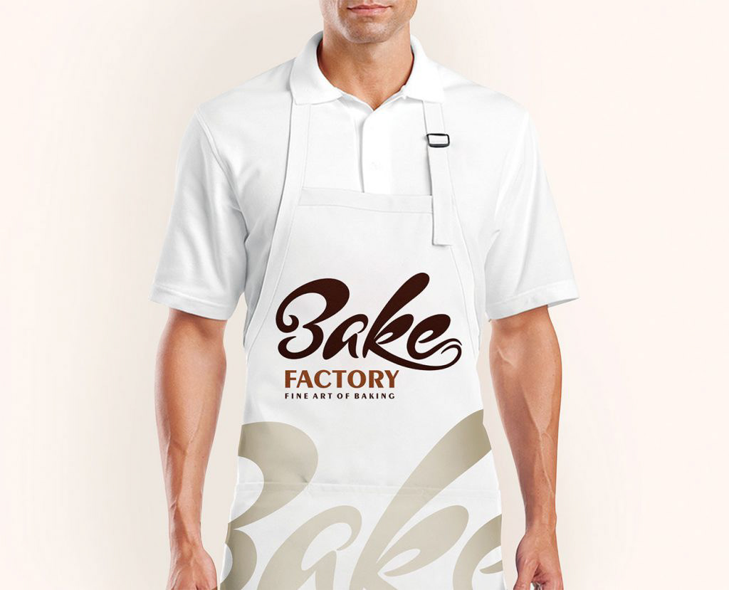
A Pune-based branding & design studio, Cub Design recently created identity for Bake Factory which will have you reaching out for the genuine baked goodness!
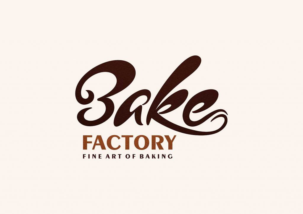
Pune-based Bake Factory approached Cub design for a clean and elegant identity that suits the brand and their tagline ‘Fine Art of Baking’. The identity was to reflect the essence of belongingness and connectivity. Banking on the USPs, it was clear to create a decorative identity based on the company name, instead of an icon based logo.
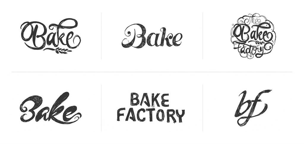
Initial mood boards were the attempts at typography and calligraphy, which were later developed using colours. The soft swirl of chocolate in the final logo connects with their audience and tempts the prospective buyer; the final logo is a combination of brand’s warmth and grabs attention in a jiffy. Thoughtful design makes this logo highly recognisable and trusted symbol for genuine baked products.
The resultant logo for Bake Factory represents the friendly and playful environment of this unique place which attracts consumers for their delicious sweet treats